Light - Soft Light - Saturation
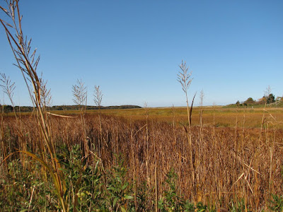
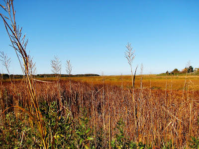
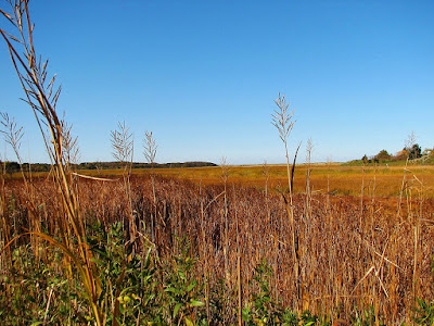
The first photograph is the original. The 2nd and the third I played with light and soft light and finally saturation. The middle shot has a low opacity to the light, with a high opacity of the soft light and the last shot is the opposite. Saturation was upped on each one, although the middle more than the last.

Levels - Brightness/Contrast - Color Dodge/Burn
The first photograph is the original. The second and the third photographs, I played with the levels. I pulled in the black and the white and where the gray was just a little bit on the middle shot and really exaggerated it on the third shot. The brightness was lowered a little in the 2nd and even more so on the third, while the contrast was upped on the 2nd and even more on the third. Same with the color dodge/burn. The middle one was just slightly edited with those two, while the third was exaggerated.

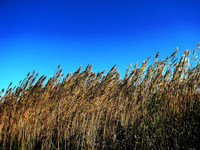
Curves - Color Balance - Saturation
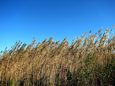
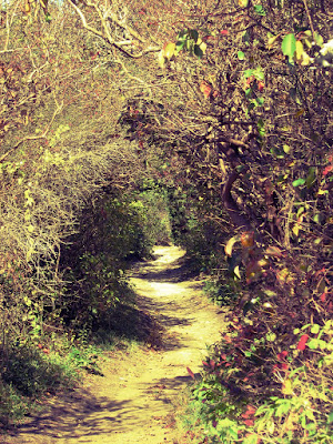
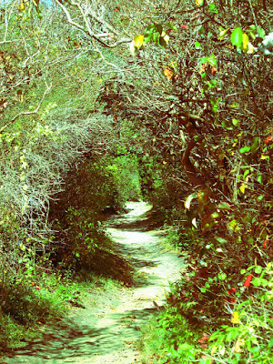
The first of these three is the original. The second and third photographs I played with the curves on each color, R,G,B and then as a whole RGB. With the color balance I pulled it more towards one color or another. Finally with saturation, on one I lowered the saturation and the other I upped it.

No comments:
Post a Comment